I don’t use Yahoo! mail very often, despite the fact it offers unlimited storage. I have moved all my relevant conversations to Gmail ever since it launched. Now I use the Yahoo! mailbox as an online storage for all the large files I might need sometime in the future.
When I logged in today, I was greeted with a message announcing changes to the interface. The part about filtering messages from connections and contacts was already available for some time. What really caught my eye was the interface redesign.
There are three main changes that I noticed from the start:
- The buttons and tabs have a new look. The buttons are actually very similar to the ones in Gmail if you ask me, but with a slight blue glow (green when hovering);

- The space occupied by the ads was reduced, both on the ‘What’s New’ page and on the right. Personally, I don’t see a big enough difference from before, as I still need an ad-blocker to hide these annoyances;

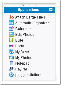
- The ‘Applications’ sections was moved to the bottom of the left panel. This is the best change in this round of updates, because they were previously placed between the ‘Inbox’ and ‘Folders’ sections, separating two closely related email functions. Since the number of applications increased lately, that space was becoming pretty crowded. Furthermore, two small arrow-like buttons allow you to hide the applications completely and their box can be resized at will by dragging the top divider.
Looking at the articles on the blog, I’m not sure how new the changes are, they seem to date back at least a month, but were probably just now enabled for my account. Overall it’s a welcomed change for Yahoo! mail, it looks a bit more modern, although the responsiveness of the menus hasn’t changed much.
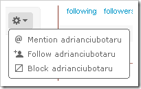
Twitter also got a small face lift today. The buttons for (un)following that show up when you visit a profile now have a much nicer 3D-appearance and a menu was added to the right for common actions like replying, following or blocking the user.
 This menu appeared some months ago in the pages that list your followers and people you follow. Although it allows for a cleaner interface, it lacks the ability to perform the action simultaneously on multiple users, which can be a pain if you have lots of followers. I’m hoping my current favorite twitter client, brizzly, will add this feature soon, this would give it a serious edge over the standard Twitter interface.


Post a Comment